Toggle
A toggle is used to quickly switch between two possible states. They are commonly used for “on/off” switches.
Overview
Toggle is a control that is used to quickly switch between two possible states. Toggles are only used for these binary actions that occur immediately after the user “flips the switch”. They are commonly used for “on/off” switches.
Live demo
This live demo contains only a preview of functionality and styles available for this component. View the full demo on Storybook for additional information such as its version, controls, and API documentation.
Variants
| Variant | Purpose |
|---|---|
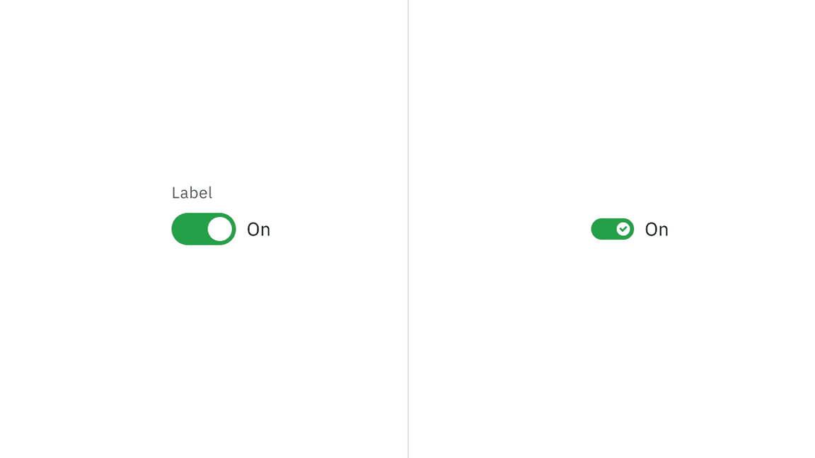
| Default toggle | Use the default toggle when you need to specify a label text in addition to the toggle action text. Default toggles appear in forms or within full pages of information. |
| Small toggle | Use the small toggle when you do not need to specify label or action text. Small toggles are more compact in size and are used inline with other components. |

Default and small toggle variants
Content
Label text
Label text must accompany a toggle to further clarify the action that the toggle performs.
Action text
Use text to describe the binary action of toggle so that the action is clear. Action text must be three words or less and is displayed on the side of a toggle.
Language
Use adjectives rather than verbs to describe actions and the state of the object affected.
Behaviors
States
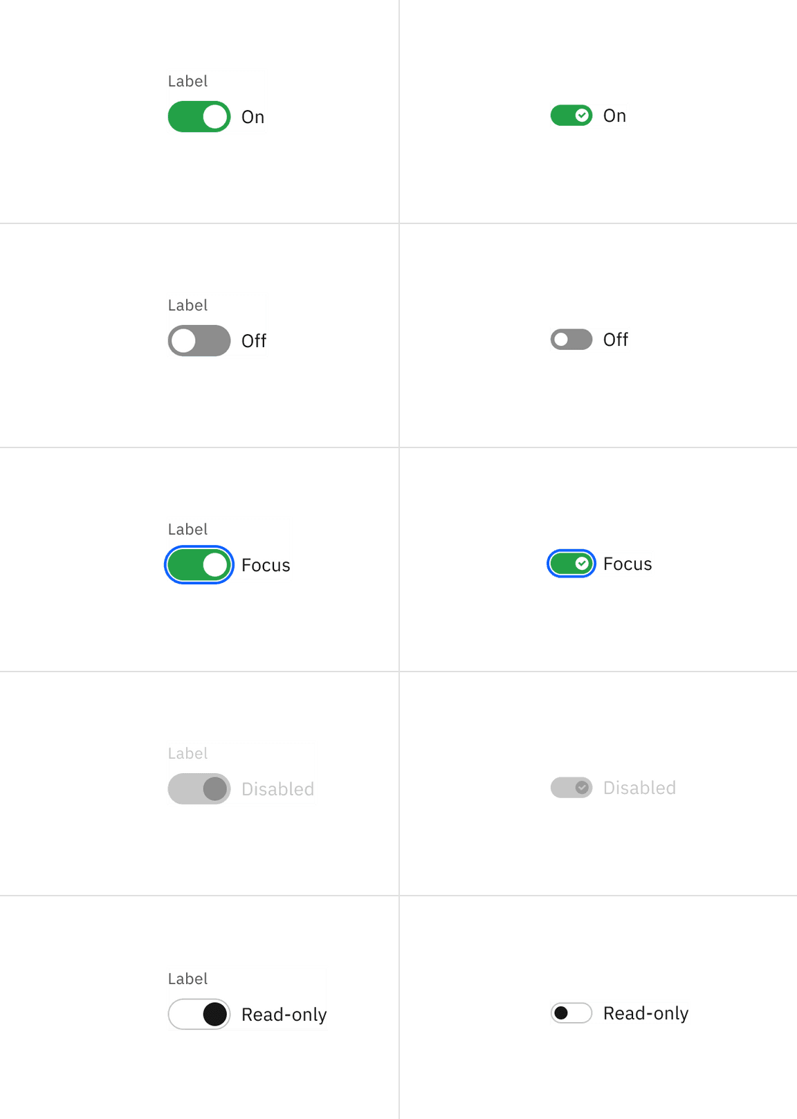
Toggles have six states: on, off, focus, disabled, skeleton, and read-only.

Example of toggle states
Default toggle
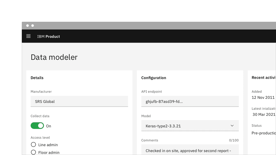
Default toggles are larger in size than small toggles. They are commonly used in forms and can appear within full pages of information that are not restricted in space. Default toggles are required to display visible label and action text.

Example of a default toggle in context
Small toggle
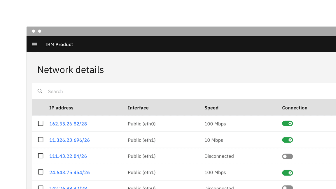
Small toggles are often used in condensed spaces and appear inline with other components or content, for example, inside data table rows. Unlike the default toggle, the small toggle is more compact in size and displays a checkmark tick in the on state to ensure the toggle is still accessible without requiring visible label or action text.

Example of a small toggle in context
Feedback
Help us improve this component by providing feedback, asking questions, and leaving any other comments on GitHub.